Accessibility Design

Website design in accordance with WCAG Level AA accessibility standards for Belhelcom

Design accessible for everyone
Website redesign comparison showing before and after. The before site uses a dense, text-heavy layout with a purple header and multiple columns of news and themes. The after site has a clean modern design with a sidebar menu on the left, a large header image of a serious woman among a crowd, and a simplified news section with colored blocks and clear headlines about human rights in Belarus, along with a newsletter signup section at the bottom.

Challenge

Update the website design, taking into account compliance with WCAG AA accessibility guidelines.
Services

  • Website review
  • Accessible design (WCAG Level AA accessibility standards)
  • Preparing the website design in Figma for handoff to your developer
  • Integrations
  • Ongoing support (if needed)
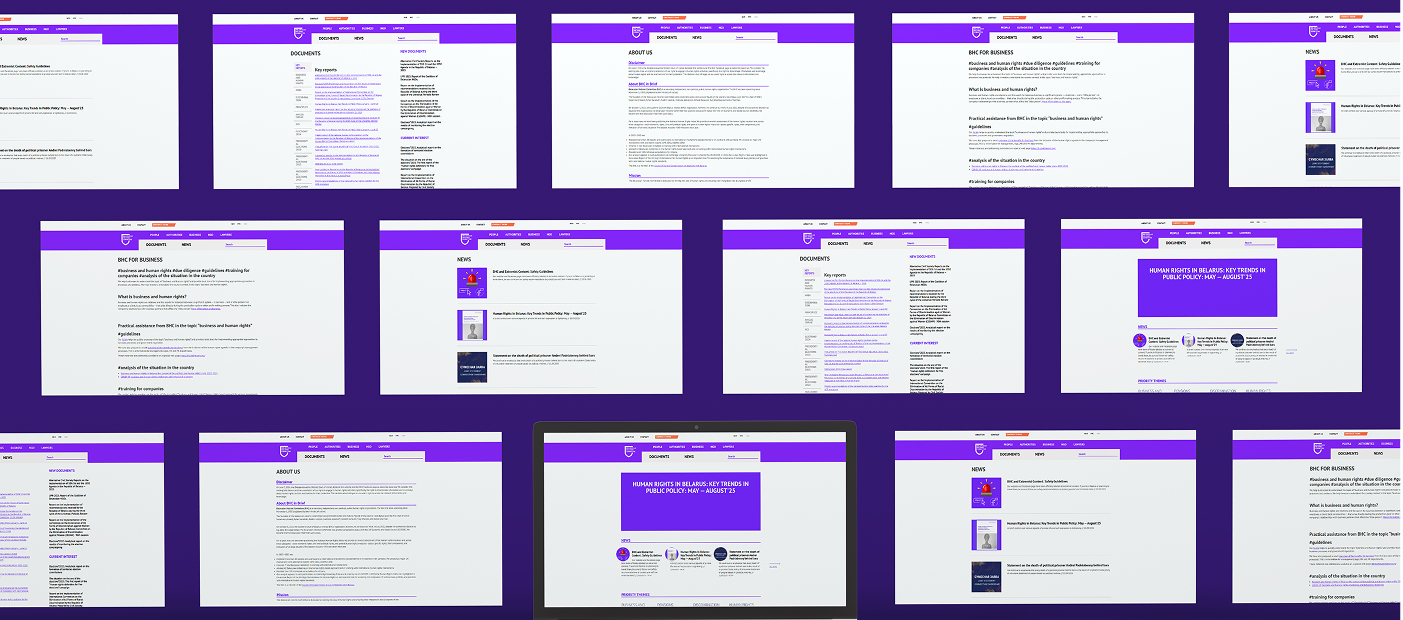
Collage of multiple website pages featuring a purple-themed interface with sections labeled Documents, News, About Us, and BHC for Business. Pages display lists of key reports, news articles on human rights, business and human rights guidelines, and public policy trends in Belarus. The layout includes menus, headings, paragraphs, and links, with consistent purple headers and white content areas, showing various informational content focused on human rights and business topics.

Critical accessibility issues were identified on the website, making it virtually ‘invisible’ to people with disabilities.

Collage of five screenshots showing a website with a purple sidebar menu including About us, Documents, News, Contacts, People, Authorities, Business, NGO, and Languages. The main content displays news articles, priority themes, and document listings. News features a photo of a person holding a megaphone and a close-up of a woman. Priority themes section lists topics like Forced Labour and Human Rights Based Approach with dropdown options. Document section shows files with small preview icons and metadata. There is a 'Let's keep in touch' subscription form with envelope icons. The interface uses white backgrounds and purple and green accent colors.

We kept the main structure of the site but made it easier to understand, more accessible, and more visually appealing. This project clearly demonstrates that it is not necessary to sacrifice visual appeal in order to achieve accessibility.
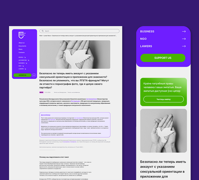
Screenshots of a responsive website design for human rights news, showing desktop, tablet, and mobile views with purple and green color accents, headlines about racial discrimination and Belarus human rights, navigation menu, search bar, latest news sections, and priority themes.Mobile phone screen and three overlaid web page panels showing sections of the Belarusian Helsinki Committee's website, including headlines on human rights in Belarus, latest news about racial discrimination and executions, and priority themes like forced labour and human rights based approach with options to support or sign up for updates.
Person with long dreadlocks wearing a red beanie and black shirt, smiling up at the camera while holding a tablet and stylus, surrounded by black and white letter cutouts on a light surface.

Get in touch if you have any questions or ideas – I strive to respond within 24 hours, even if I'm busy.

Follow me on
Linkedin